From being the driving force behind social media to running the economy, data has become such prevalence in our lives today. Somehow, I’ve always dreaded data. All my interactions with data – from collection to inference – the facts, figures and numbers have been dull and lacklustre.
This all changed to the point where I was eagerly looking forward to accessing and understanding my data when Spotify Wrapped rolled out in 2017. Music is a common thread that helps us connect with people, so having data-driven conversations was an unforeseen change for me.
One of the pivotal reasons Spotify Wrapped struck a chord with me was because it helped me share an aspect of myself – my personality and interests online. I found it to be the perfect amount of information about me without giving away too much!
Spotify started very humbly back in 2015 by curating the top 100 tracks of the year which was rebranded as Spotify Wrapped in 2016. It has now become a highly anticipated affair across the globe.
Spotify Wrapped was a huge success, given that they had the first mover’s advantage in this field, but the long-standing success of this campaign was because they started small and scaled it bigger and better over the years.
The company’s ingenuity in compiling personal statistics into a story with vivid aesthetics and tongue-in-cheek humour pushed us into a new era of data visualization. This trend has caught on with everyone from food delivery apps to Google maps – who share yearly data in a more interesting way. In specificity, this trend works for Spotify because they understand that music is a reflection and extension of your personality.
Spotify jumped on the social media bandwagon and showcased Wrapped in a story format, popularized by Instagram, which made it easily shareable. The colourful approach is an integral aspect as well because the campaign is usually slotted for release during the holiday season, it gives it a more celebratory feel and fits the ‘Instagram Story aesthetic’. This format has driven and propelled the campaign to the forefront of the data visualization era.
A key lesson from Spotify’s campaign is understanding your audiences. They picked the right points to highlight and refined it to suit the audience, year after year. Wrapped uses data-rich stories to build a personalised experience, that is presented as your Year In Music. It is contextual, relevant and helps the audience express their individuality.
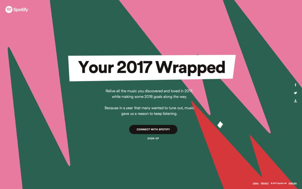
Soundtrack of the Year (2017),
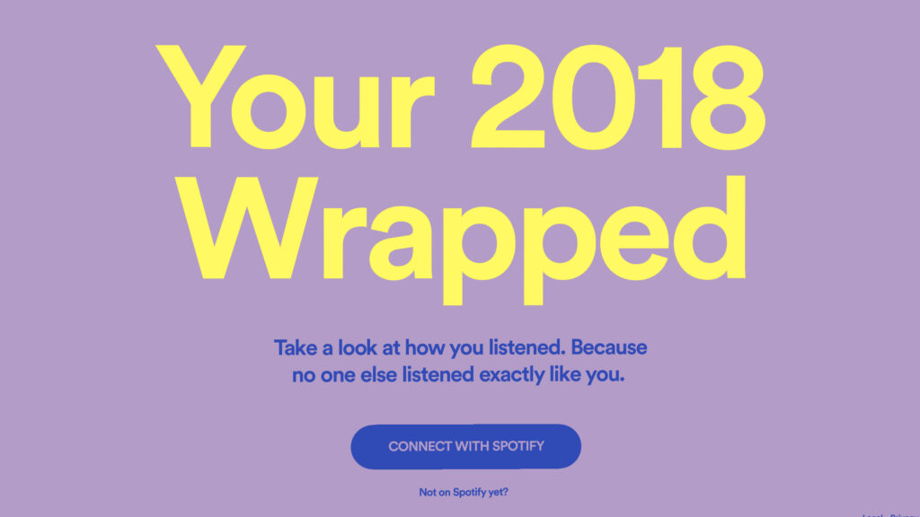
2018 Goals,

Decade of Discovery (2019),
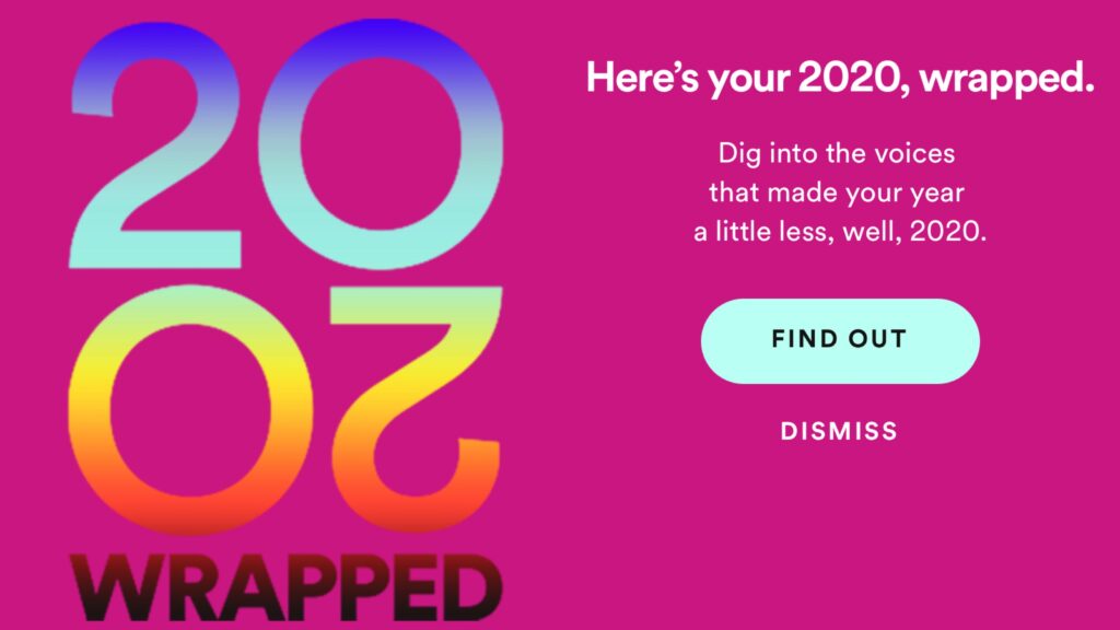
and #2020Wrapped.
Although Spotify Wrapped is classed as a marketing campaign, it’s much more than that. A marketing campaign aims at informing their audience and a brand offers experiences. Spotify Wrapped is an extension of the Spotify experience, in essence, a brand in itself. A brand built for data and visualisation.
If you’re ever considering designing your interpretation of the ‘year in review’ concept, a cardinal rule is to analyse your touchpoints. This concept will see the same success only if the audience plays an active role in it. Think of Uber sharing their yearly stats – it would only work if I got to see my longest ride rather than the number of hours Uber has driven other people around. The next step to using the data from a specific touchpoint is the presentation. In specificity, presenting data in a story format has become the trend. It is part of building the experience, so channel your creativity and storytelling to evoke a feeling. Storytelling is a powerful yet simple tool that helps audiences immersive themselves in the experience rather than consume (read: skim) the data.
Brand engagement through personalised interactions is the way forward. Brands interact with consumers through several touchpoints, so drill down to a specific touchpoint where the audience’s interactions are unique. Lastly, keep in mind that, Spotify Wrapped works because the audience gets to share an aspect of their personality, which is distinctive yet contextual to every individual – this motivates audiences to share it organically.
